Saskatoon's Remai Modern creates buzz following its new, $90,000 look
One critic says it 'looks like some 70s detective show theme'
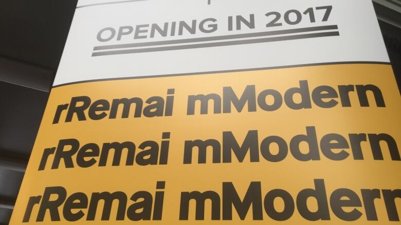
Remai Modern has been garnering attention since the art museum unveiled its new branding on Tuesday, at a cost of $90,000 for its new visual identity.
In a statement from Remai Modern, the museum said thatthe New York-based design group karlssonwilker Inc., was chosen to brand the art museum based on the firm's extensive experience and the strength of its proposal. The firm has worked with high-profile clients in the past such as Warner Bros., Capitol Records and the Museum Of Modern Art.
A total of 12 proposals were submitted from a "mix offirms based in Saskatchewan, elsewhere in Canada, and the U.S.," the statement said.
Remai Modern has subsequently generated some buzz on social media following thelaunch of its new look.
I think it's, you know, pretty crappy. It looks like some 70's detective show theme.- David Williams, Edwards School of Business
David Williams, associate professor of marketing at the Edwards School of Business, offered both his subjective and objective opinions regarding the new logo and colours thatRemaiModern has opted for.
"My opinion doesn't count for much, but Ikind of hate it," said Williams. "I think it's, you know, pretty crappy. It looks like some 70s detective show theme."
@LeishaCBC People who are angry about this are the same people who say "my kid could draw that" about art they don't like.
—@luteouspangolin@LeishaCBC I like it. And it gives people who like to instantly complain about everything purpose in their lives.
—@SheldonStenerCan't please everyone
But Williams also points to recent marketing redesigns byInstagramandStarbucksas examples of public backlash tobrandingefforts.
@LeishaCBC @CBCSaskatoon I'm not one of the ppl that complains about every aspect of the gallery. I support the gallery, but this is garbage
—@MarcHoltsaxUmm
Looks like a typo https://t.co/GopbdG3pCK
—@action_jay"Whatever they came up with, it can't please everyone," he said.
I think that we need to know how much #yxe taxpayers paid a NY agency to spend TWO YEARS coming up with this. #YXECC https://t.co/GcEDFcsjIf
—@tammyrobertOne local marketingexpert thinks that while the new look will cause a lot of "divergent opinions," it's also a reflection ofthe continued push for diversity in the arts in the province.
I think in terms of style it's bold, it's contemporary.- Garnet McElree, The Marketing Den
"I think in terms of style it's bold, it's contemporary," said GarnetMcElree, creative director with theMarketing Den. "I think it also starts a conversation.
"Sometimes if something is too safe, or adopted too easily, there's also a risk then that it hasn't done its full job of reaching its potential."
Gregory Burke, CEO of Remai Modern, unveiled the new logoTuesday at the Saskatoon FarmersMarket.
"The brand, with the use of the upper and lower [case], is kind of Canadian. Very strong, but modest at the same time," Burke said. "We wanted to express the fact that we were always going to be evolving and changing, and take you by surprise."
More meaning for locals
But for Williams, the new branding could have contained some more local content.
"I think one of the biggest mistakes they made is not using someone from Saskatchewan, given the climate of fiscal restraint," Williams said. "They went to the best, and they went to New York for [a] designer, but I think they need to incorporate some more local expertise."
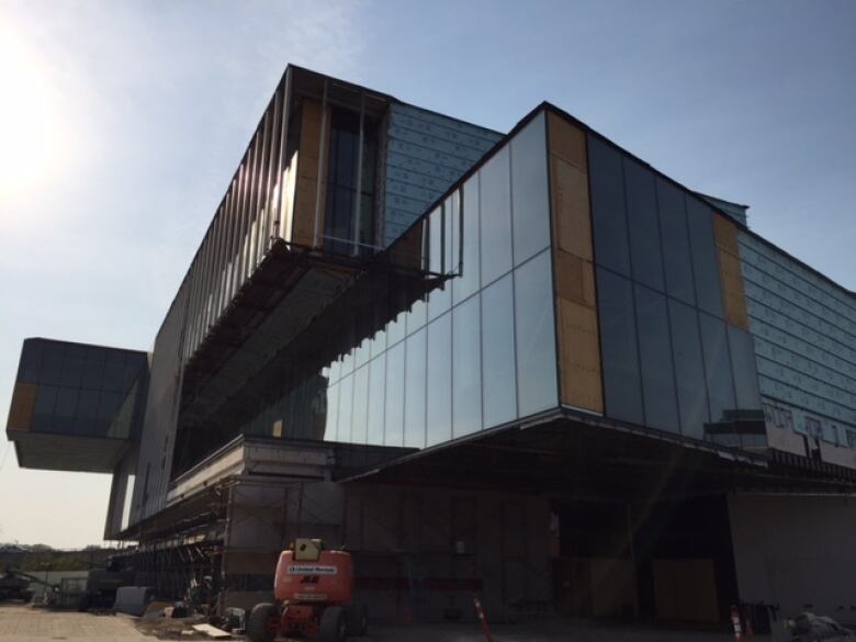
Remai Modern has branded itself ahead of the opening of its new, 130,000 square foot home in 2017.


_(720p).jpg)

 OFFICIAL HD MUSIC VIDEO.jpg)
.jpg)