Pipeline project: From grainy documents to interactive map
How CBC converted 405 pages into a usable resource
With public interest in pipelines soaring to new heights in recent years, CBCNews.ca decided to dig into information about some of the largest lines that cross the country.
Last August, we submitted an access-to-information request asking for 12 years worth of data on pipeline incidents from the National Energy Board (NEB), the federal regulator that oversees pipelines that cross borders.
About five months later, a CD containing the documents arrived at CBC News.
They included page after page of detailed information about each and every pipeline safety incident that companies are required to report.
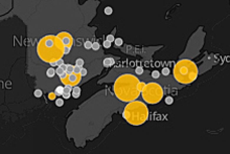
The incredible wealth of information allowed us to map each one of the 1,047 incidents so that Canadians could see whats happening in their neighbourhood and across the country. Users can also filter by the type of incident, the substance or even the year.
Getting to this point wasnt an easy process. The first quandary we faced was the form that the 405 pages of data came in.
What was once an Excel spreadsheet had been parcelled out into two PDFs containing three separate sections. Basically, each row describing an incident was now spread across three pages located in two documents.
The first 238-page document was split into two sections. One contained about 10 columns, such as Company, Substance and Amount Released, while the second had three columns with key information such as Province, Nearest Community and Event Type.
With each row of information in the first document split across multiple pages, it was difficult to pull together.
The second file was even worse. The access-to-information coordinator had run it through a redaction program, AccessPro, to take out names and other identifying information.
That turned it into a grainy image of the original spreadsheet. It was a massive challenge to turn that back into text.
In the end, CBC had to use commercial optical character recognition (OCR) software, which converts images of text into editable documents, plus custom programming to convert the image back into text and put it back together as a data set.
We then geocoded the longitude and latitude for the nearest population centre noted in the NEB logs so that we could map it out.
To be able to visualize the size of spills, we also standardized the amount of oil or gas spilled which was recorded by NEB largely in cubic metres but also in kilograms, litres, tonnes and other units into one measurement: litres. NEB helped convert the weights into volumes.
Our first version of the map was solely published internally as a research tool for journalists spread out in different cities.
Using geographic information system (GIS) software, we explored a decades worth of incidents to find patterns and trends.
Though CBC News had requested the database in its original Excel spreadsheet format,current access-to-information laws dont require departments to release information in its original form. Often, officials turn spreadsheets into difficult-to-convert PDFs, citing concerns the documents could be manipulated.
Even once CBC managed to get the pipeline incident data set into an Excel spreadsheet, it became apparent that our work was not done.
A surprising number of cells were empty. Until 2005, for example, the column for Event Type is only filled out in a handful of cases.
And a slew of incidents that involved a spill or leak had blanks in the Volume Released column, even when an amount was specified in the summary.
The NEB told CBC that the database is a snapshot in time meant for internal use only.
Blank fields may simply be a result of human oversight and do not necessarily indicate that the information is not stored somewhere else by the board, an email from the NEB stated.
However, CBC was also told that this was the only pipeline incident database.
To add clarity to the messy and incomplete database, CBC spent time sifting through the 1,047 incidents and filling in the blanks wherever detailed information was provided elsewhere in the row.
Users can see exactly what changes CBC made in the interactive by downloading a CSV file of the data.
As much as the CBC tried to clean up the database, what became apparent was the amount of information that appeared to widely fluctuate between employees.
Sometimes summaries contained multiple updates about a spill. Other times, there was not even enough information to determine whether it met the criteria for an event that companies must report.
One of the biggest troubles with the database is the lack of information about the end result. Was the company reprimanded? Was the death or spill or injury investigated, and what was the finding?
Even the field designed to capture the amount of a spill or leak that had been recovered was often left blank.
CBC News tracked down investigation reports of individual incidents where possible and posted the links in the website.
We hope the resulting website is something useful to the Canadian public and one that will improve in the future.
In fact, CBC is hoping people across the country will help us. You can share your stories about individual incidents or help us verify the trickier parts in the records that were converted almost perfectly, but not quite. Find out how to help by visiting the map.
If you have any pipeline-related stories, please email us atpipelines@cbc.ca.


_(720p).jpg)
 OFFICIAL HD MUSIC VIDEO.jpg)
.jpg)